CF: Tell us a bit about yourself, what were your first encounters with visual art and music? When did you first realize the importance and the impact of combining the two?
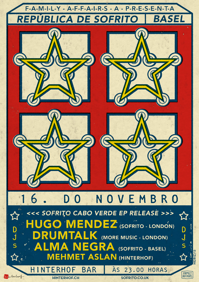
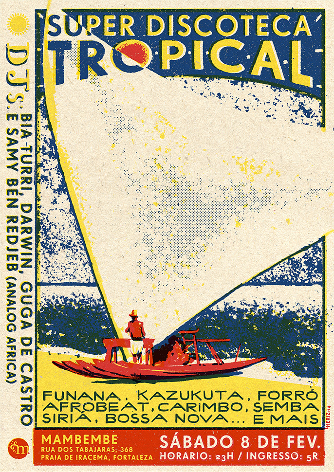
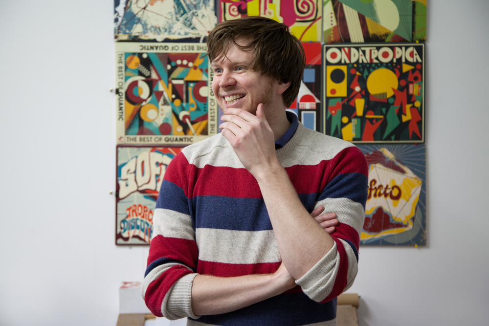
Well I suppose if I was being thorough here I’d say my first encounters were with my family – my mum’s an artist, my dad’s a musician, my grandparents and most of my extended family too. I guess because I was surrounded by records, and as a kid I used to stare at them playing for hours and read the sleeves, mesmerised by the relationship between the physical object and the sound coming out of it, the combination of the visual and aural made an impression from early on. But it wasn’t ’til I began collecting records around 2002 that I started thinking consciously about it, and a few years later I began trying it out with posters for the nights my friends and I were putting on. In terms of my own work and the task of matching image with sound, that all began with those posters.
CF: How did you start designing record covers and where did you first draw inspiration from?
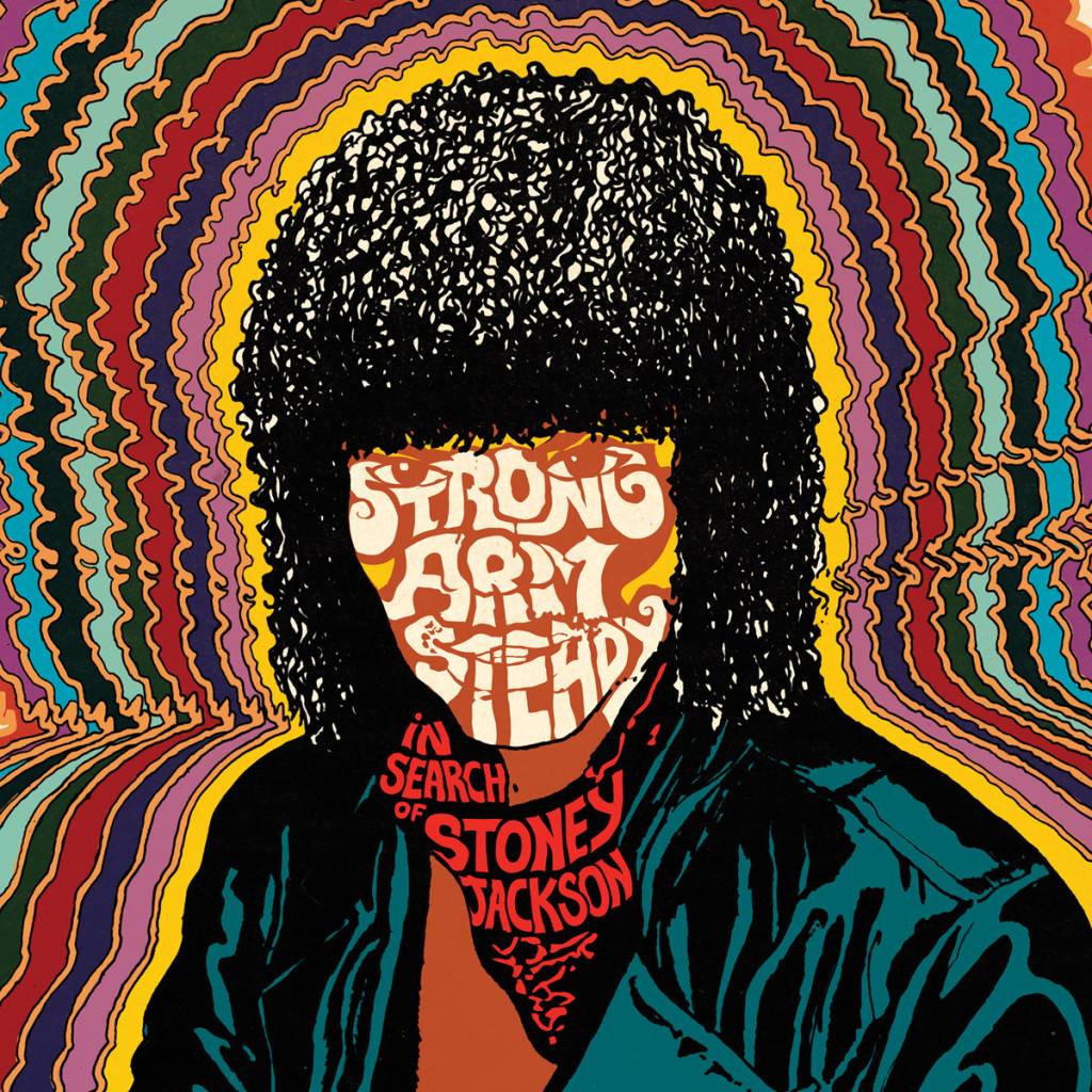
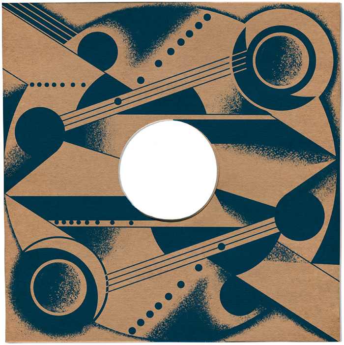
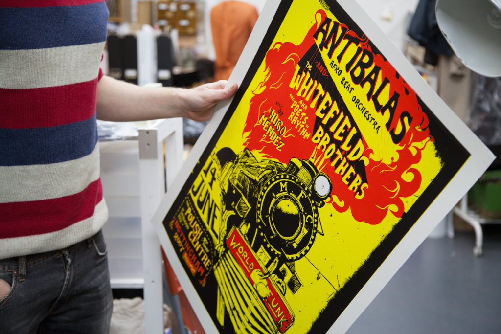
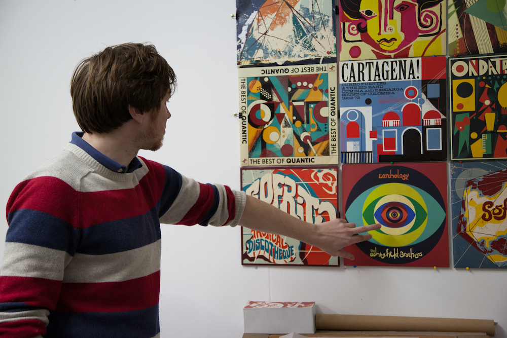
The first record cover was for The Apples’ Buzzin’ About. That came directly from us promoting them in Nottingham for their first tour. We used to kick out our housemates and turn our house into a hotel for the night, and get our mate who cooked suspiciously delicious curries for huge numbers of people to provide the food. Proper shoestring stuff, but it made for a more memorable stay for them, I think. Well they liked the poster enough to approach me to design their LP. It was a bit of a baptism of fire when I look back on it actually, a full album design and layout job is a totally different prospect to a poster, and I learnt that the hard way… I found that looking at LPs that you could call ancestors of their music was only partially helpful – it aided me in getting a feel for what worked, but ultimately I had to create something original, so I just listened to the album on repeat and messed about until it clicked. The same thing happened with The Whitefield Brothers’ Earthology album on Now-Again. They approached me after we’d put them on a couple of times, and after they played (as Karl Hector and the Malcouns) for a Sofrito night, they approached me to do their LP.
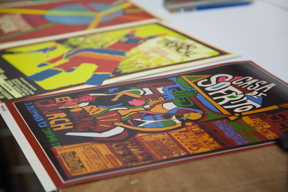
With the posters, the first artists that really got me excited about the form were those from Cuba’s ICAIC, the institute set up after the revolution to promote film as an art form in the country. The fact that they were charged with the task of inspiring the people to produce films rather than just consume the imports meant that there was some incredible innovation, all created with the old-fashioned cut-out stencil technique. They’re just amazing. I suppose I looked upon Bachs, Nico, and Reboiro as unofficial tutors – not just in use of colour and composition but in the marriage of those with a concept. Yeah, they were very important during the first couple of years.
“If I love an album I usually love the cover too, however shit it might be”
CF: You design covers for music that comes from different corners of the world, without physically traveling there, how do you paint a picture in your mind of what the cover should look like?
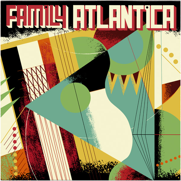
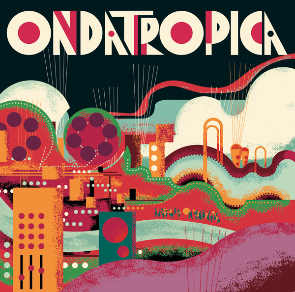
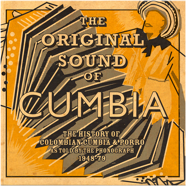
The records I work on mainly fall in two categories: reissues and new music. Reissues and compilations are relatively easy. I research the LP covers of the music being re-released and the related art, fashion, typography and so on from the time and place they were released, to create a pool of references which I then whittle down to a few stand-out styles, colour combinations, printing techniques etc. I then have to match this to the brief I’ve been sent by the label, and depending on the details of that, start putting together some rough concepts. Crucially during all this I will listen to the tracks on repeat, and allow a bit of intuition to guide the decisions as I work, because if I don’t feel it then I’m far less likely to make a decent image. Because everyone involved has different references and thoughts about what the cover should be, I have to take that into account too. I can’t rely just on my own relationship with the music – that’s not what the job requires at all.
New music is a very different process, and far, far harder. It all depends on what the band or producer is aiming for, and where they currently fit in the constantly-shifting contemporary musical landscape. It all comes from the brief, really. It’s a near-impossible task to create something that works for everyone involved if there isn’t a rock-solid brief from the start that comes from some in-depth chat. One of the worst things to hear for me on these jobs (as nice as it is) is ‘we love your stuff, just do your thing!’ – that doesn’t work because, much to my dismay, I’m not a psychic, so I could spend all the budget doing some things you just happen to not be into.
But with both there is often a balancing act between triggering references that people get intuitively, and pushing away from stereotypes to give the music a fresh break from cliche. That’s why I also look at designs for ‘World Music’ releases and think, how can we stand out from that and break away from the visual tropes of that increasingly meaningless category? Because a generic standard doesn’t do the music justice, yet you also have to catch the attention of an audience that will appreciate it. It’s quite a balancing act, really.
CF: If you could choose a soundtrack for your work, what would you choose?
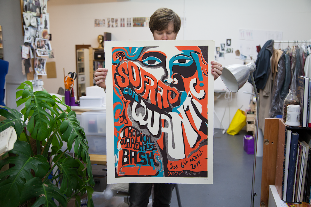
Oh man. That’s either impossible or extremely easy, as the soundtrack to my work is the music I did the work for! But if I had to choose, I think it’d make most sense for it to be Sofrito’s back catalogue, because those records are just as much about the side of London I love as they are about music from elsewhere. Sometimes I worry that I’m not really the person who should be doing a particular job, if it’s for music from a place I know nothing about beyond what I see through my UK-based telescope. But Sofrito came from the parties specific to London, and its uniquely enriched culture that’s a direct result of the people that brought a piece of every country in the world to it through their migration. Sofrito always felt like a balls-out celebration of that, and that’s really where I’m coming from when I work, too.
“the first artists that really got me excited about posters were those from Cuba’s ICAIC”
CF: Do you have any favourite album you would choose to re-design a cover for?
Another tricky one… If I love an album I usually love the cover too, however shit it might be. Sometimes I love the cover because it’s awful, as it gives it some character that a tasteful cover might not. I would love to have a go with an LP cover that was originally a fairly straightforward photo job, as they can be if the artist is famous enough and their face does the selling. Al Green’s Explores Your Mind would be brilliant to redo. Or James Brown’s It’s a Mother, though I still love that a little bit too much.
CF: What is your favourite thing about living in London?
It seems to me that with every negative point about London, you can counter with an example of the opposite being true. It’s a city that’s churning itself up all the time, but if you manage to find constants and hang on to them while they last, it’s an amazing place to be. For me it used to be the music, mainly, but with work taking over a bit recently, I’ve been really appreciating the exhibitions, museums and libraries. Visiting other cities you do realise how lucky we are here in that respect, that so much of it is free. (For now.)
Oh, and the people. As soon as I moved here I loved the mix of people. If ever I feel a bit stuck, I go out with a sketchpad and draw them. I could do that all day and never get bored.
CF: Aside from continuing to work on record covers, do you have any other plans in mind for the near future? Are there any other surfaces you would like to explore with your work?
On the client-side, I’m looking to get more book cover work. I absolutely love it, plus I need to read more. I’m working – slowly – on some narrative stuff, and there are plans for animations too, though ‘near-future’ may be pushing it with those… I’m also putting together some pieces based on my drawings of people on transport that I’ve been doing since 2006. That’s also a big job, but I’m getting there. In the immediate future, I’m going to be spending some time in South America where I’ll be working on some ideas, sketching and painting, not just to widen my portfolio but – I hope! – to push my work into some new directions, and solidify a few ideas I’ve had for a while for an exhibition. We’ll see…
